BRANDING STRATEGY
World of Caesar
Oct 2019
World of Caesar is a restaurant and bar located in the urban Kingston area of Jamaica. This is an Italian restaurant, themed around Italian and roman culture & history. They serve historical food from roman mythos and tailored towards Italian cuisine. World of Caesar aims to be authentic and accurate to Italian history and culture, describing themselves as exotic, and authentic, a cultural representation of the lifestyle of the ancient ancestors.
Duration
6 WEEKS
Role
Identity Design
For this project we researched a lot about the history and mythos of Italia and the history of its food and when. Where and how food was prepared and presented. To keep authentic and true to the culture, but more importantly to learn and be a part of that culture and slice of history.
Challanges
We had a lot of fun creating and designing this project, even though we had a few challenges going into this project. It was the first we had to tackle a restaurant, especially one at with the ideology and calibre World of Caesar boasted. Creating a design that wasn’t generic but easily recognizable and flexibly was our biggest challenge. In additionally, following a design that was prestigious in presentation and attractive to World of Caesar's target patrons was no easy feat, but we do believe we prevailed.
Goals
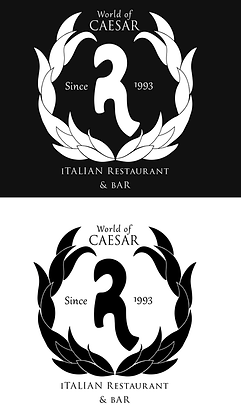
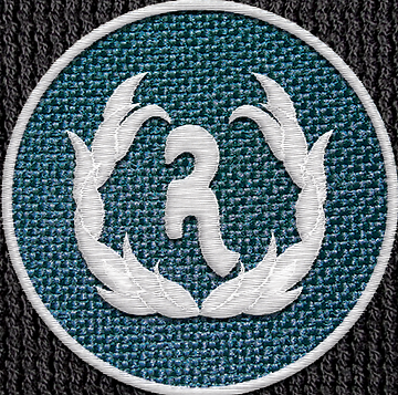
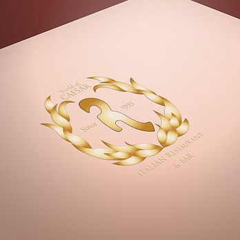
In this project, we aimed to create a branding logo that resembled luxury and recognizability while remaining flexibly and in tone with the culture and history of ancient Italy. Our aim was to emulate a design that was familiar in presentation, but not generic. We chose the Crown that adorn on of the Most famous figure of Roman history and culture, the laurel Wreath, similar wormed and adored by Appollo the Olympian god of Archery, Music, dance and poetry. A fitting correlation of the aims of the restaurant and its goals to attract patrons.
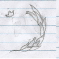
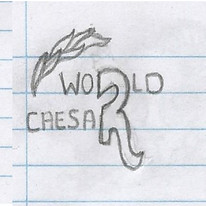
Finding a fitting logo took a lot of research, attempts and trails, but ultimately, we agreed on an adaptation of the Laurel Wreath and stationed within it a stylized not 100% geometric ‘R’. The letter r symbolizes the unity between the two major words of the title, as oppose to using the highlighted and obvious Initials of W, O or C – and the decision to go with a funky ‘R’ was to represent the not so perfect way of life of the Olympian gods and goddess.
As was the construction of the logo Icon was planned out, so was the decision to choose the colors of Golden yellow and other dynamical colors. Gold is a color adored by royalty and meaning, more so in the ancient roman culture and mythos.