
BRANDING STRATEGY
gUARDSMAN
GROUP
NOV 2019
Guardsman group is a popular Jamaican security company in the Caribbean. They are a congregation of companies, whose goal and purpose to provide security and safety to their customers across the island of Jamaica and the Caribbean as a whole. This was a passion project taken on to modify the current Guardsman Security logo. The current logo was described as “awkward” and “unrepresentative of the company’s brand and purpose”.
Duration
2 WEEKS
Role
LOGO DESIGN
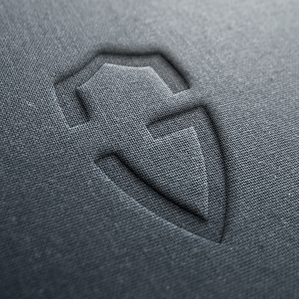
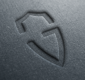
We chose to design an alternative of the current Guardsman brand logo, as it misrepresents the company’s brand and purpose, as a Security Company. To protect and keep their customers safe.
Challanges
One major challenge faced with the applying a solution to this situation is the lack of information on the “client’s” website. We were unaware why they chose such a design for their brand, and what was it to represent to them as a company going forward. The decision to change their previous logo to the current was unstated, and we spent a lot of time guessing and questioning, what the change was to represent.
Goals
Our goal was to create a logo that represent the branding and personality expected of a security company. We assumed that the company wanted to personal and modern branding, one that is safe and recommendable, but reinstate their purpose and presence in the current technological world. We aimed at a logo design, that was bold and proud, one that is stood in the current day, and resent them on a technological, but secure level.
Pros
- Modern Design is very attractive
- Colour scheme is simplistic and effective
- Simplistic design/Minimalist is more effective.
Cons
- Unrepresentative of the company’s works and methods
- unrecognizable and generic
- looks like a mobile app logo
- Misleading design for consumers and the brand’s purpose
- Geometry is not uniformed and looks uncomfortable and clunky
- Represents a security logo, designed for a security company
- Personal and used generic elements to create something unique
- Doesn’t just look like a mobile app
- Geometrically uniformed using the golden ratio method.


